Your login information returned multiple users. Please select the user you would like to log in as and re-type in your password.
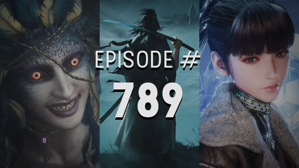
 There's been a lot of discussion about the new Castlevania over the last year among members of our podcast. The game is set to release this Tuesday and it's time where actual opinions can be made. But one thing that can already be commented on is the cover art.
Above you can see both covers for the US Release. Regular version on the left. Collector's Edition on the Right. I'm still a little fuzzy about the details but I have a feeling that the Collector's Edition Cover is just going to be the box that it comes in and not the actual disc sleeve. Which means that inside the collector's box, will still be the regular edition. But it might not be the case.
Either way that sucks as I much prefer the artistic cover over the 3-d model cover, which I think makes it look much more gamey. The artistic cover gives it a much more Castlevania feel and makes it feel like a true adventure. Of course it looks nothing like Gabriel Belmont but that's beside the point.
As far as I know the Japanese Release of the game will feature the artistic cover which is what I saw at TGS and what originally inspired me to make this post.
What do you guys think? Character Model or Artistic Cover?
Also, although Castlevania is coming out, I think most of us will be playing Enslaved first. Both Nick and Brad have stated that they'll be saving Castlevania for after. And I'll probably do the same for the case of everyone being able to talk about the game on next week's show. See you next week.
David
Previous Comparison: Sin & Punishment: Star Successor

Comments
13 years, 7 months ago
i have to say the artistic one on the right is much more appealing. though its a shame the actual game weren't look like that. if anything though, you could wait for people to scan the special edition, print it out yourself and put in the game as the cover. I knew some people who would do that when a games official art was crappy. sometimes used fanart for the cover.
13 years, 7 months ago
I agree, the artistic version of the cover is more appealing than the CG one. It gives off the old school Castlevania box art vibe (like Super Castlevania's), though it doesn't give a grand scale on what you're up against on the cover. It's just Gabe and his super darkened expression.
13 years, 7 months ago
I like the artistic cover...but if it makes any sense I like the coloring in the background on the CG cover. I think it's because the super blue coloring of the background on the artistic cover makes the character lighting look off; unless he's standing under a lamp post or something. Basically, I would like less 'blue' in the background of the artistic color, either add some more neutral quality to it or bring out more lighting and shadow or color.
That's just my taste though, but of course I support artistic covers over CG because eventually the CG cover is going to look dated.
13 years, 7 months ago
The one on the right blows the other one away. It actually manages to capture a Castlevania feel and aesthetic in my opinion. I'll just have to admire it from afar though because I'm sure as fuck not dropping $80 for this game.
13 years, 7 months ago
The one on the right does look very Castlevania but does it accurately portray the feel of the game? The left one puts him in more light and you can see his face while the other one is kind of dark and you cant see his eyes. It kinda gives him a mysterious feel or he doesn't speak much. But in the game he doesn't seem like a mysterious stranger at all and he does communicate with several characters. So the left one is a bit suitable I guess. That doesn't deny the one on the right has cool stylish artwork...but I can do without that intense blue background.
13 years, 7 months ago
The one on the right looks like they photoshoped Alucard's head onto Gabriel's body. It is more of the Castlevania aesthetic but I don't think it fits the game at all. I actually like the one on the left more. Yeah its more gamey but at least you can see what you're going to get. I can see a lot of people getting fooled by the cover on the right (expecting one art style and getting another.
13 years, 7 months ago
I don't really like either of them, to be quite honest. At least in comparison to what I would have preferred:
http://wallpaper-s.org/18__Castlevania_-_Lords_of_Shadow.htm
It is the perfect nod to Super Castlevania IV:
http://www.pushsquare.com/wp-content/uploads/2009/06/castlevania.jpg
13 years, 7 months ago
If the art cover is for special edition, then they know that those who have played the older games would have more incentive to buy special edition. The CG cover is much more appealing to those who never really tried a Castlevania game before.
I'm not really a Castlevan fan but I can see who they were trying to appeal with the covers.
13 years, 7 months ago
I do like the one on the right better as far as artistic style goes but it really doesn't look like Gabriel from the game.
13 years, 7 months ago
Beaten the game on Saturday.It was really great,opposite to enslaved.
As a fan of digital distribution I'm really picky about game covers cause I don't have a lot of CE/LE,Ill spend more money if I have to just to import the better looking case.
Though if possible the smarter thing would be just to find a high quality print shop...
13 years, 7 months ago
The one on the left is generic action character such as prince of persia. The one on the right oozes castlevania. The long flowing hair and the dark and forboding backround makes me actually want to buy the game. Too bad the games model doesn't look like this but instead looks like the generic gq model most uninspired action games use.
13 years, 7 months ago
The artistic box art has more vibrant colors in my opinion. The deep blue background contrasts well with the red armor. That alone makes the drawn art more appealing than the cg render. Also, the darkness of the eyes in the drawn art, as well as the flowing hair, give more detail to the character. The cg model just makes him look like 'generic cranky guy with hair no. 4'. His armor looks pretty similar in both images, so not much to complain about there.
13 years, 7 months ago
I like the artistic style better, but how much will the collectors edition cost? Will it come with anything else?
13 years, 7 months ago
The artistic box cover is 1000x better, but fuck it if I'm going to pay 20 bucks more for it. And I don't care about the art book or the soundtrack.
13 years, 7 months ago
Artistic cover is much better. I too was more excited for Enslaved and thought I would play it first. I put 5 or so hours into it and while it was good it just wasn't doing it for me. I popped Castlevania in just to install it (360) and decided to play a few minutes. A few hours later I had to force myself to put it down to go to sleep. I won't be playing Enslaved again for a while.
13 years, 6 months ago
[...] Here is a larger version of the art for those who’d like a closer look. Last Week’s Comparision: Castlevania: Lords of Shadow [...]